Bedrock Forms
Bedrock Forms allow you to display native Bedrock Edition UI forms to players connecting through Geyser/Floodgate. Instead of seeing a chest-based inventory, Bedrock players get a native form experience adapted to their platform.
Bedrock Forms require Geyser or Floodgate to be installed on your server. zMenu uses the Floodgate API to detect Bedrock players and send forms.
File Location
Bedrock forms are stored in the plugins/zMenu/bedrock/ folder. Each YAML file represents one form.
plugins/zMenu/bedrock/
├── simple-form.yml
├── modal-form.yml
└── custom-form.yml
Form Types
zMenu supports three Bedrock form types:
| Type | Description |
|---|---|
simple | A form with a title, optional content text, and a list of buttons |
modal | A confirmation form with a title, content text, and exactly 2 buttons |
custom | A form with input fields (text, toggle, dropdown, slider, label) |
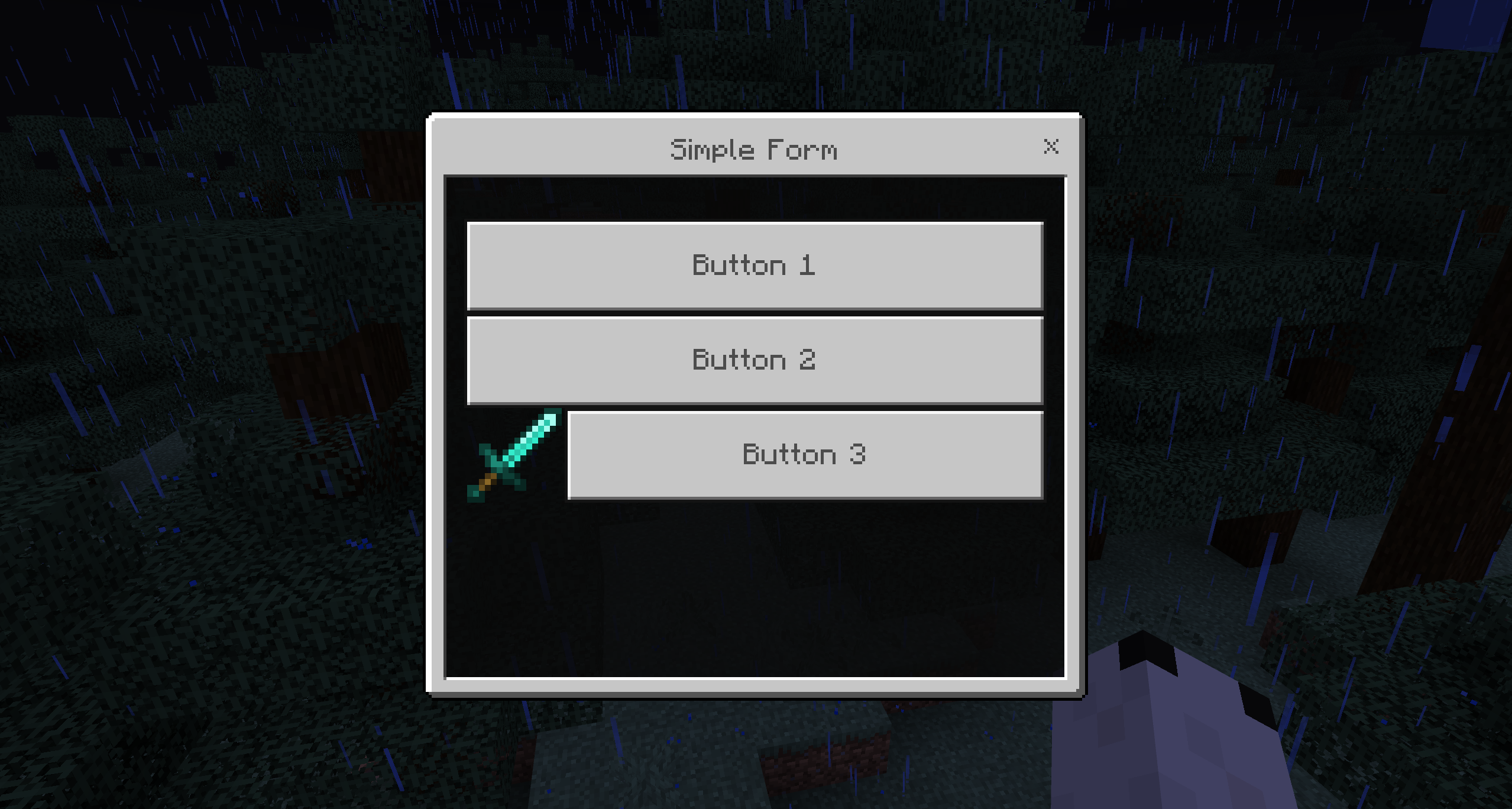
Simple Form
A simple form displays a list of buttons the player can click. Each button can have an optional image.
Configuration
type: simple
name: "Simple Form"

buttons:
  button1:
    type: "bedrock_button"
    text: "Button 1"
    click-requirement:
      1:
        success:
          - type: message
            messages:
              - "&aAction for button 1"
  button2:
    type: "bedrock_button"
    text: "Button 2"
    image-type: "URL"
    image-value: "https://github.com/GeyserMC.png?size=200"
    click-requirement:
      1:
        success:
          - type: message
            messages:
              - "&aAction for button 2"
  button3:
    type: "bedrock_button"
    text: "Button 3"
    image-type: "PATH"
    image-value: "textures/i/glyph_world_template.png"
    click-requirement:
      1:
        success:
          - type: message
            messages:
              - "&aAction for button 3"
bedrock_button
| Option | Type | Required | Description |
|---|---|---|---|
text | String | Yes | The button label displayed to the player |
image-type | String | No | Type of image: URL (web image) or PATH (resource pack texture path) |
image-value | String | No | The image URL or texture path |
click-requirement | Section | No | Requirements and actions executed when the button is clicked |
The placeholder %content% is available in click actions and contains the form's content text.
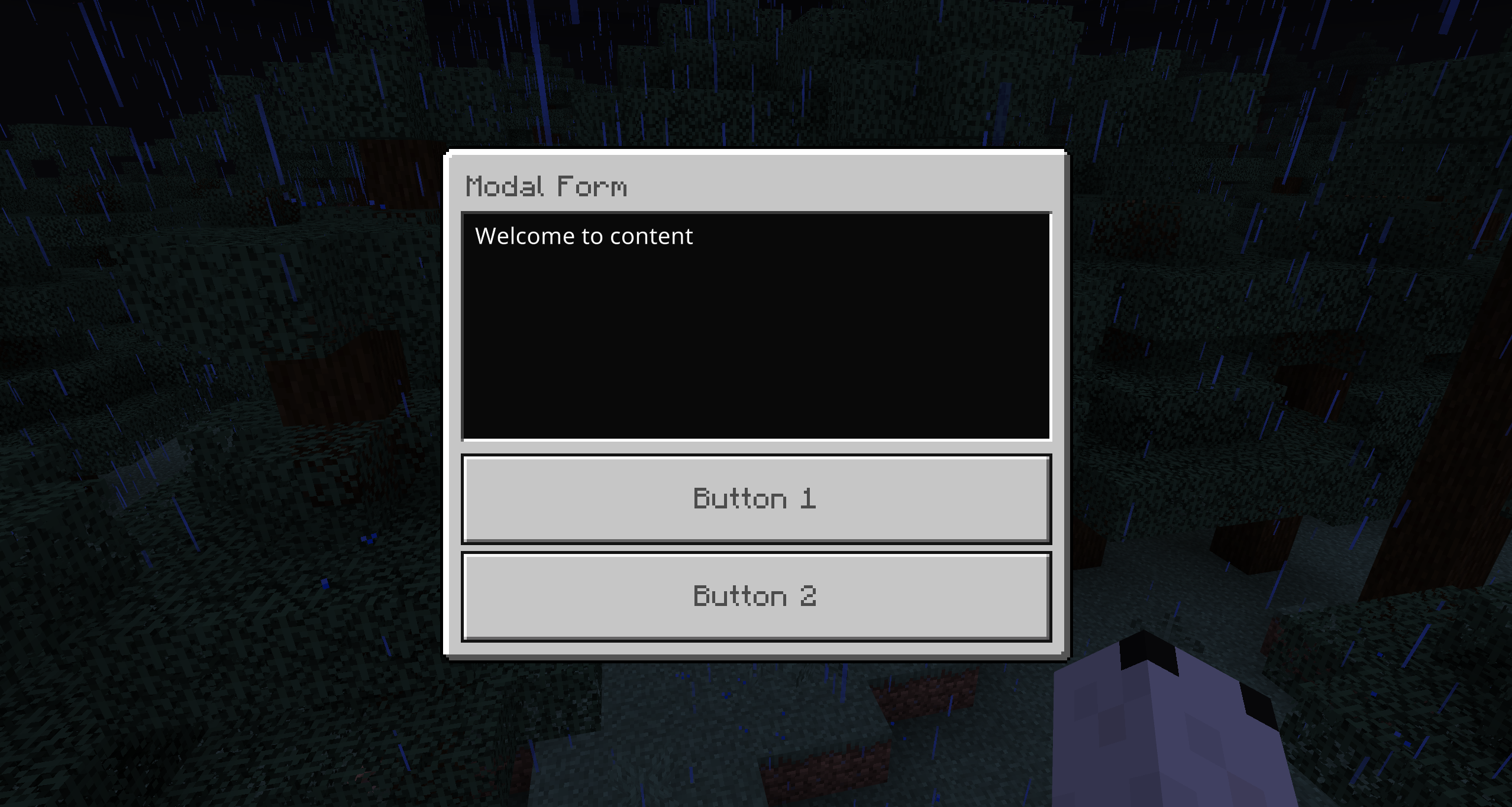
Modal Form
A modal form is a simple confirmation dialog with a title, content, and exactly 2 buttons.
Configuration
type: modal
name: "Modal Form"
content: "Welcome to content"

buttons:
  button1:
    type: "bedrock_modal_button"
    text: "Button 1"
    click-requirement:
      1:
        success:
          - type: message
            messages:
              - "Thank you for your feedback! text : %content%"
  button2:
    type: "bedrock_modal_button"
    text: "Button 2"
    click-requirement:
      1:
        success:
          - type: message
            messages:
              - "We're sorry to hear that! Please let us know how we can improve. %content%"
bedrock_modal_button
| Option | Type | Required | Description |
|---|---|---|---|
text | String | Yes | The button label |
click-requirement | Section | No | Requirements and actions executed when clicked |
A modal form must have exactly 2 buttons. If fewer than 2 are defined, the form will fail to load. If more than 2 are defined, only the first two will be used.
The placeholder %content% is available in click actions and contains the form's content text.
Custom Form
A custom form allows you to create a form with various input fields. The player fills in the form and submits it. The values of each input are available as placeholders using the button key name (%key%).
Configuration
type: custom
name: "Custom Form"

buttons:
  # Label text (read-only)
  label:
    type: bedrock_label
    text: "I love bedrock inventory."
  # Text input
  text:
    type: bedrock_text
    text: "Share your thoughts about our server:"
    initial-value: "This server is amazing because..."
  # Toggle (on/off)
  toggle:
    type: bedrock_toggle
    text: "Would you like to receive server updates?"
    initial-value: true
  # Dropdown selection
  dropdown:
    type: bedrock_dropdown
    text: "Choose your mode"
    options:
      option1:
        id: "survival"
        display: "Survival Mode"
        initial: true
      option2:
        id: "creative"
        display: "Creative Mode"
        initial: false
      option3:
        id: "adventure"
        display: "Adventure Mode"
        initial: false
      option4:
        id: "pvp"
        display: "PvP Arena"
        initial: false
  # Slider
  slider:
    type: bedrock_slider
    text: "How many hours do you play per day?"
    start: 1
    end: 12
    step: 1
    initial-value: 3

actions:
  1:
    success:
      - type: message
        messages:
          - "Thank you! text: %text%, toggle: %toggle%, dropdown: %dropdown%, slider: %slider%"
Input Button Types
bedrock_label
A read-only text label. Does not produce any value.
| Option | Type | Required | Description |
|---|---|---|---|
text | String | Yes | The label text to display |
bedrock_text
A text input field where the player can type freely. Also accepts the alias bedrock_text_input.
| Option | Type | Required | Description |
|---|---|---|---|
text | String | Yes | The label/placeholder text |
initial-value | String | No | Pre-filled default text |
bedrock_toggle
An on/off toggle switch.
| Option | Type | Required | Description |
|---|---|---|---|
text | String | Yes | The toggle label |
initial-value | Boolean | No | Default state (true or false, defaults to true) |
bedrock_dropdown
A dropdown selection list.
| Option | Type | Required | Description |
|---|---|---|---|
text | String | Yes | The dropdown label |
options | Section | Yes | List of options |
Each option has:
| Option | Type | Required | Description |
|---|---|---|---|
id | String | No | The value returned when selected (defaults to option key name) |
display | String | Yes | The text displayed in the dropdown |
initial | Boolean | No | Whether this option is selected by default (only one can be true) |
bedrock_slider
A numeric slider.
| Option | Type | Required | Description |
|---|---|---|---|
text | String | Yes | The slider label |
start | Number | No | Minimum value (default: 0) |
end | Number | No | Maximum value (default: 100) |
step | Number | No | Step increment (default: 1) |
initial-value | Number | No | Default value (defaults to midpoint between start and end) |
Custom Form Placeholders
In a custom form, each input value is available as a placeholder using the button's YAML key name. For example, if you have a button with key text, you can use %text% in the actions section.
Custom Form Actions
Unlike simple and modal forms where each button has its own click-requirement, custom forms use a shared actions section at the root level. These actions are executed when the player submits the form, with all input values available as placeholders.
Dynamic Buttons
Dynamic buttons generate several inputs or buttons from a single template, repeated over a numeric range — handy when the count is data-driven or would otherwise be copy/pasted.
Both dynamic types share these options:
| Option | Type | Description |
|---|---|---|
start | Integer | First index, inclusive. Placeholder-aware. |
end | Integer | Last index, inclusive. Placeholder-aware. |
Inside the repeated template, the %index% placeholder is replaced with the current iteration number.
bedrock-dynamic-input-button
For custom forms. Repeats an input: element (bedrock_label, bedrock_text, bedrock_toggle, bedrock_slider, bedrock_dropdown). Each generated input's value is available as the placeholder %<button-name>_<index>%.
type: custom
name: "&6Dynamic Bedrock Example"

buttons:
  # If the player types "Value A" in the first box, %dynamic_input_1% will be "Value A"
  dynamic_input:
    type: bedrock-dynamic-input-button
    start: 1
    end: 2
    input:
      type: bedrock_text
      text: "&6Enter your name #%index%:"

actions:
  1:
    success:
      - type: message
        messages:
          - "&eInput 1: &f%dynamic_input_1%"
          - "&eInput 2: &f%dynamic_input_2%"
bedrock-dynamic-button
For simple forms. Repeats a clickable button: (bedrock_modal_button), each with its own actions.
type: simple
name: "&6Dynamic Bedrock Simple Example"
content: "&7Each button shows its unique index."

buttons:
  dynamic_buttons:
    type: bedrock-dynamic-button
    start: 1
    end: 5
    button:
      type: bedrock_modal_button
      text: "&bClick Me! &e(Button #%index%)"
      actions:
        - type: MESSAGE
          messages:
            - "&aYou clicked dynamic button &6#%index%&a!"
See the bundled bedrock/dynamic-bedrock-example.yml and bedrock/dynamic-simple-bedrock-example.yml for full examples.
Common Options
These options are available for all Bedrock form types.
name
The title displayed at the top of the form. Supports color codes and PlaceholderAPI placeholders.
name: "&6&lMy Form Title"
content
The text content displayed in the form body (used by simple and modal types).
content: "Welcome! Please make your choice."
open-requirement
Requirements that must be met before the form can be opened. If requirements are not met, the form will not open.
open-requirement:
  requirements:
    - type: permission
      permission: "server.vip"
      deny:
        - type: message
          messages:
            - "&cYou need VIP to access this form!"
open-actions
Actions executed when the form is opened.
open-actions:
  - type: message
    messages:
      - "&aOpening form..."
close-actions
Actions executed when the form is closed (either by submitting or closing without submitting).
close-actions:
  - type: message
    messages:
      - "&7Form closed."
target-player-name-placeholder
Define a custom placeholder for the target player name, useful when opening the form for another player.
target-player-name-placeholder: "%player_name%"
view-requirement
Buttons in simple and modal forms support view-requirement to conditionally show or hide buttons based on conditions, similar to regular inventory buttons.
Inventory Replacement
You can automatically redirect Bedrock players to a Bedrock form when they try to open a regular inventory. This is configured on the regular inventory side using the inventory-replacement option.
# In your regular inventory file (e.g., inventories/shop.yml)
name: "&6Shop"
size: 54

inventory-replacement:
  name: "shop-form"       # Name of the Bedrock form file (without .yml)
  plugin: "zMenu"         # Plugin that owns the Bedrock form (default: zMenu)
  pages:                  # Optional: only redirect on specific pages
    - 1

items:
  # ... regular inventory buttons for Java players
When a Bedrock player opens this inventory, they will automatically be redirected to the specified Bedrock form instead. Java players will see the regular inventory as usual.
| Option | Type | Required | Description |
|---|---|---|---|
name | String | Yes | The Bedrock form file name (without .yml) |
plugin | String | No | The plugin owning the form (default: zMenu) |
pages | List of integers | No | Only redirect on these pages (empty = all pages) |
Commands
| Command | Permission | Description |
|---|---|---|
/zm bedrock open <name> [player] [display message] | zmenu.open.bedrock | Open a Bedrock form |
/zm bedrock reload | zmenu.reload.bedrock | Reload all Bedrock form files |
The <name> argument accepts the format pluginName:formName or just formName.
Examples:
/zm bedrock open simple-form
/zm bedrock open zMenu:custom-form
/zm bedrock open modal-form Notch
/zm bedrock open simple-form Notch false
Bedrock forms can only be opened for Bedrock players (connected via Geyser/Floodgate). Attempting to open a form for a Java player will display an error message.
Bedrock Action
You can open a Bedrock form from a button action using the bedrock action type:
actions:
  - type: bedrock
    bedrock: "simple-form"
With external plugin:
actions:
  - type: bedrock
    bedrock: "custom-form"
    plugin: "MyPlugin"
With arguments:
actions:
  - type: bedrock
    bedrock: "feedback"
    arguments:
      - "arg1"
      - "arg2"
| Option | Type | Description |
|---|---|---|
bedrock | String | Name of the Bedrock form file (without .yml) |
plugin | String | Plugin name if using an external form |
arguments | List | Arguments to pass |
Next Steps
- Learn about Dialogues for Paper-specific interactive popups
- Configure Actions for your buttons
- Set up Requirements for conditional logic